When Phill first suggested we have our living room at the back of the house, I thought he was mad. Growing up, our living room was called a “front room” and like everyone else’s, it was at the front of the house. So the idea of having one tucked away at the back felt very strange, possibly illegal!
Once we had the keys though, the benefits became clear.
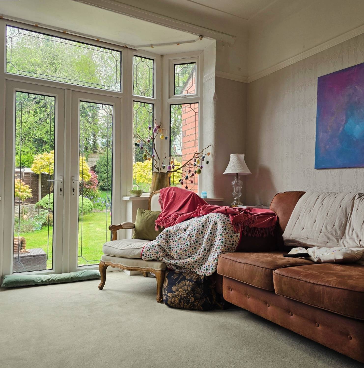
Being further away from the road meant peace and quiet, and there were double doors leading straight into the garden. Perfect for sitting with Thomas, who was then still a newborn, while Dorothy swung from trees and did cart wheels on the grass.
 But for a room with so many windows, it was surprisingly dull. The light always felt a bit… grey, just like the walls, in almost every room in the house!
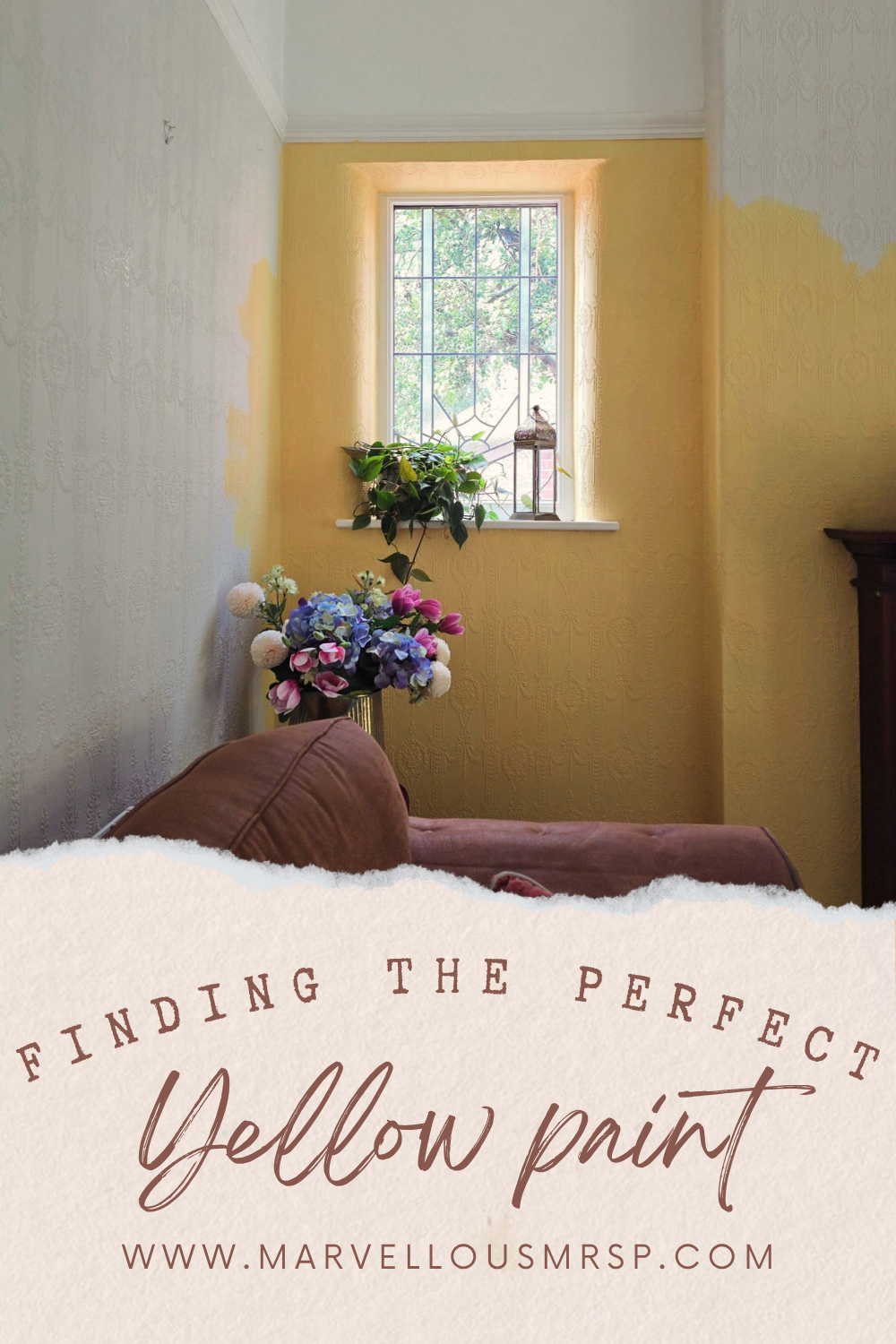
 Then, every now and then, especially in the late afternoon, the sun would hit just right and cast soft yellow lines across the embossed wallpaper. Golden hour. The idea of painting the room yellow began to take hold.
Everyone said not to rush in to anything and I sat with it for a whole year. Then as Summer approached and we planned a trip to Europe, I realised that the colour I was looking for was the warm, buttery yellow of old French buildings. That creamy, earthy shade that feels elegant and sun-warmed.
 Sadly, it’s frowned upon to bring home a brick from France, so I had to rely on memory and a bit of guesswork.
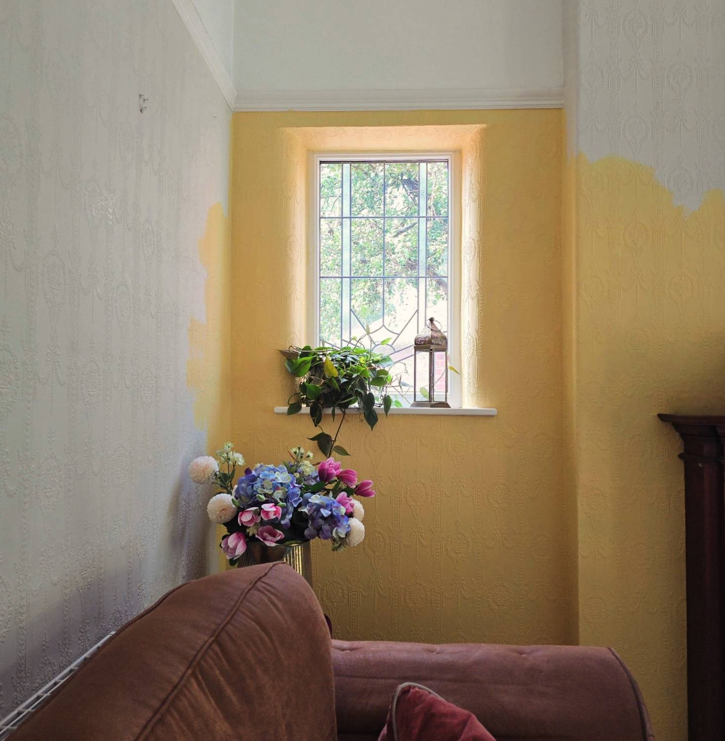
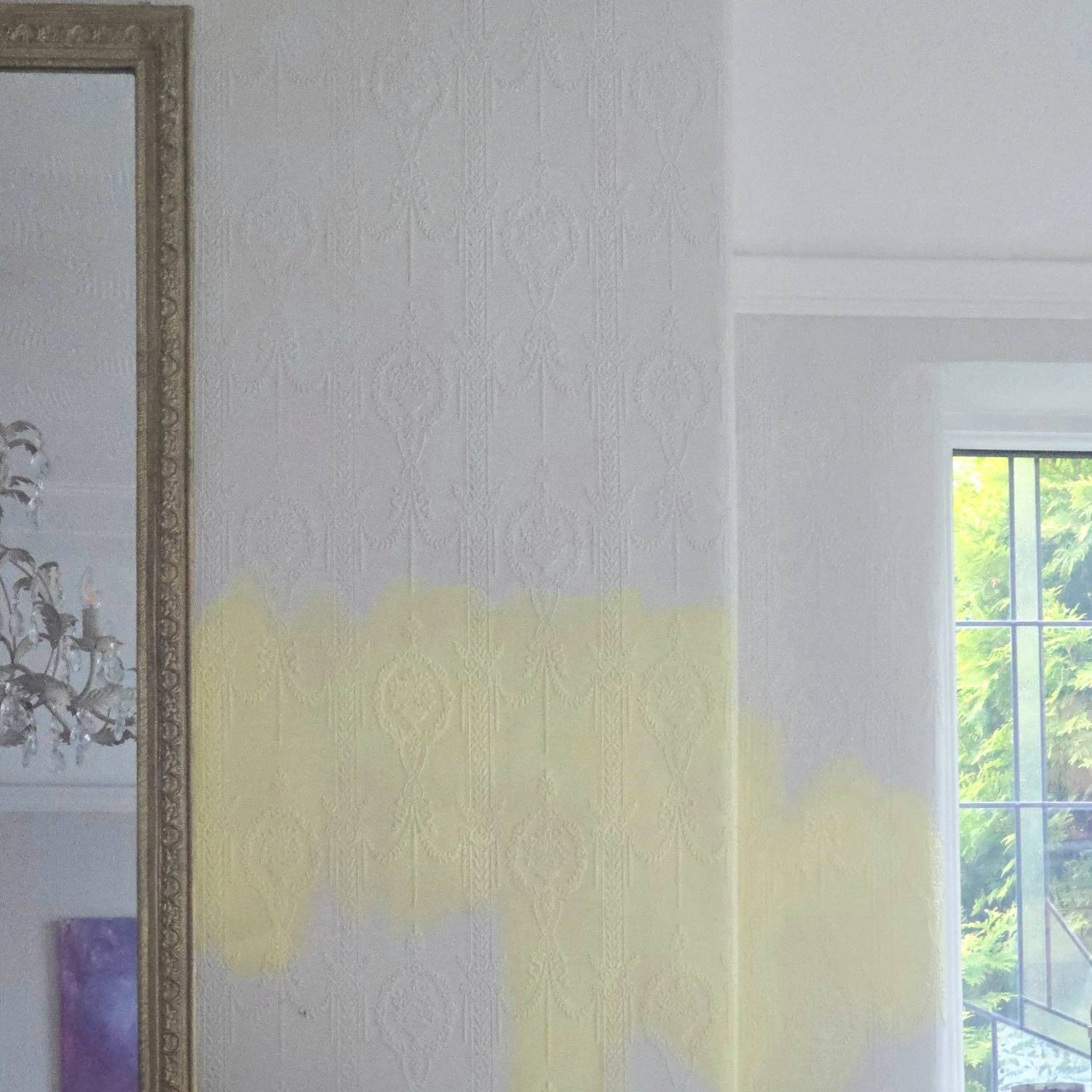 Our first attempt was a pale yellow from Dulux. The name escapes me, but honestly, it doesn’t matter. The colour was awful, and so was the paint itself. It felt like it had been watered down and so I wouldn’t recommend it. I painted a couple of patches before quickly realising it was a complete disaster. The colour reminded me of a 1990s GP’s waiting room. Much less “chic European townhouse”, more “NHS waiting times and donated magazines”. I was gutted.
What I really wanted was a rich, creamy yellow – something warm and mellow like a Nancy Meyers movie set. That led me to Farrow & Ball’s Yellow Ground … and also Dorset Cream.
I couldn’t decide between the two, and Phill said he wanted no part in this decision and that yellow was a silly colour. So, naturally, I asked a random gentleman in B&Q for his opinion. He chose Yellow Ground.
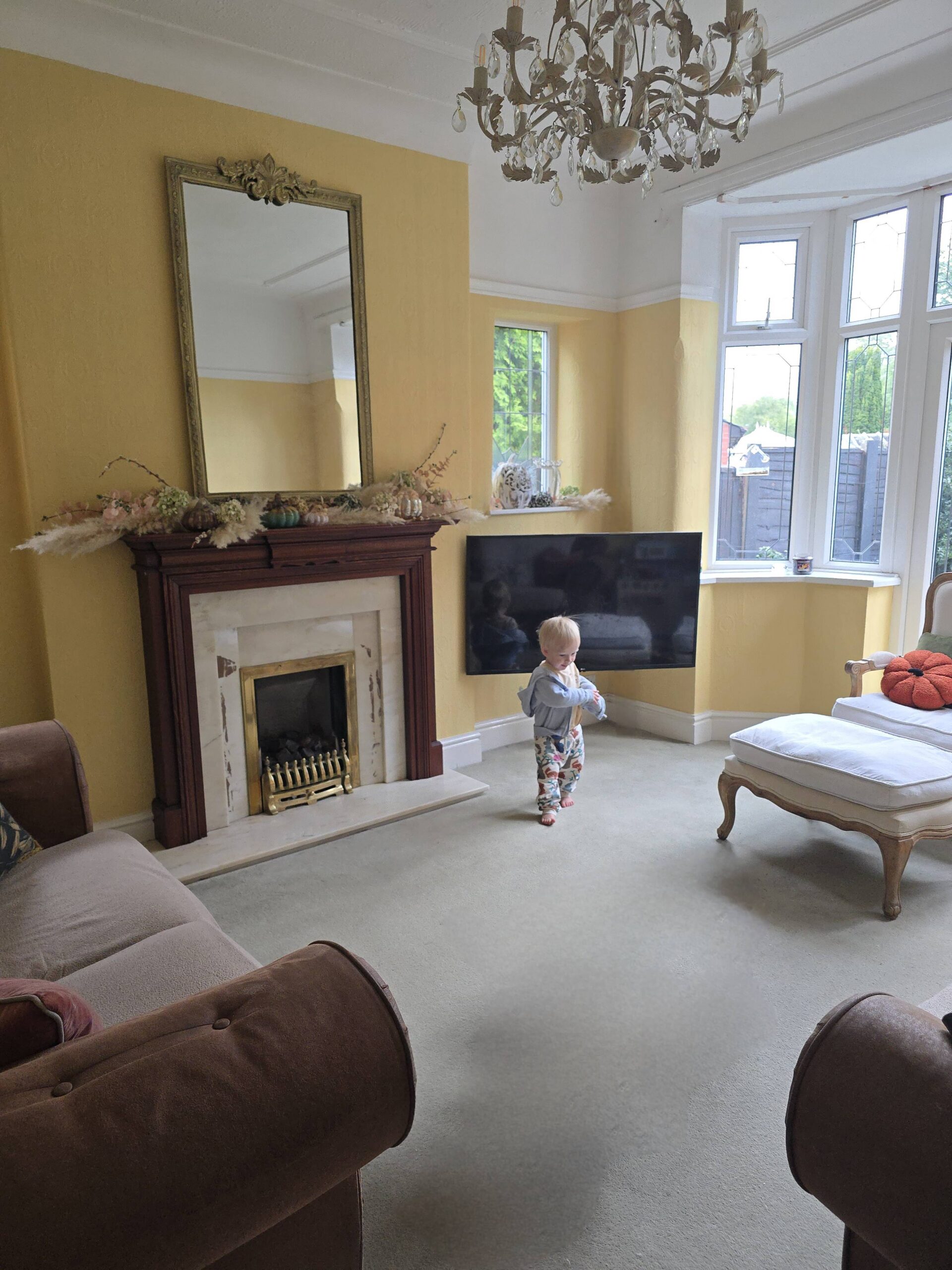
 I think I knew it wasn’t quite right after the first couple of brushstrokes, but I soldiered on and painted the whole room anyway. The colour was stunning – it was an absolute joy to paint with such a rich, bright hue. But it was quite a bit brighter than I’d intended. It had a sunflower-like quality that just didnt sit right with the fireplace and sofas. I tried to convince myself (and everyone else) that it worked, that it was the old carpet throwing off the look, the toys, the cushions – but I found myself editing the photos I took of the room and loving the filtered version more than real life. It was close… but it wasn’t it.
 As the leaves began to turn outside, my thoughts turned to Christmas and I realised I wasn’t going to love how the room looked with a Christmas tree. I didn’t really like how it looked now, despite loving the colour itself. Since I have free will and nobody brave enough to reign me in, I decided to pick up the paintbrush for a third time.
Surely not, I hear you cry. Oh yes, dear reader, third time’s a charm.
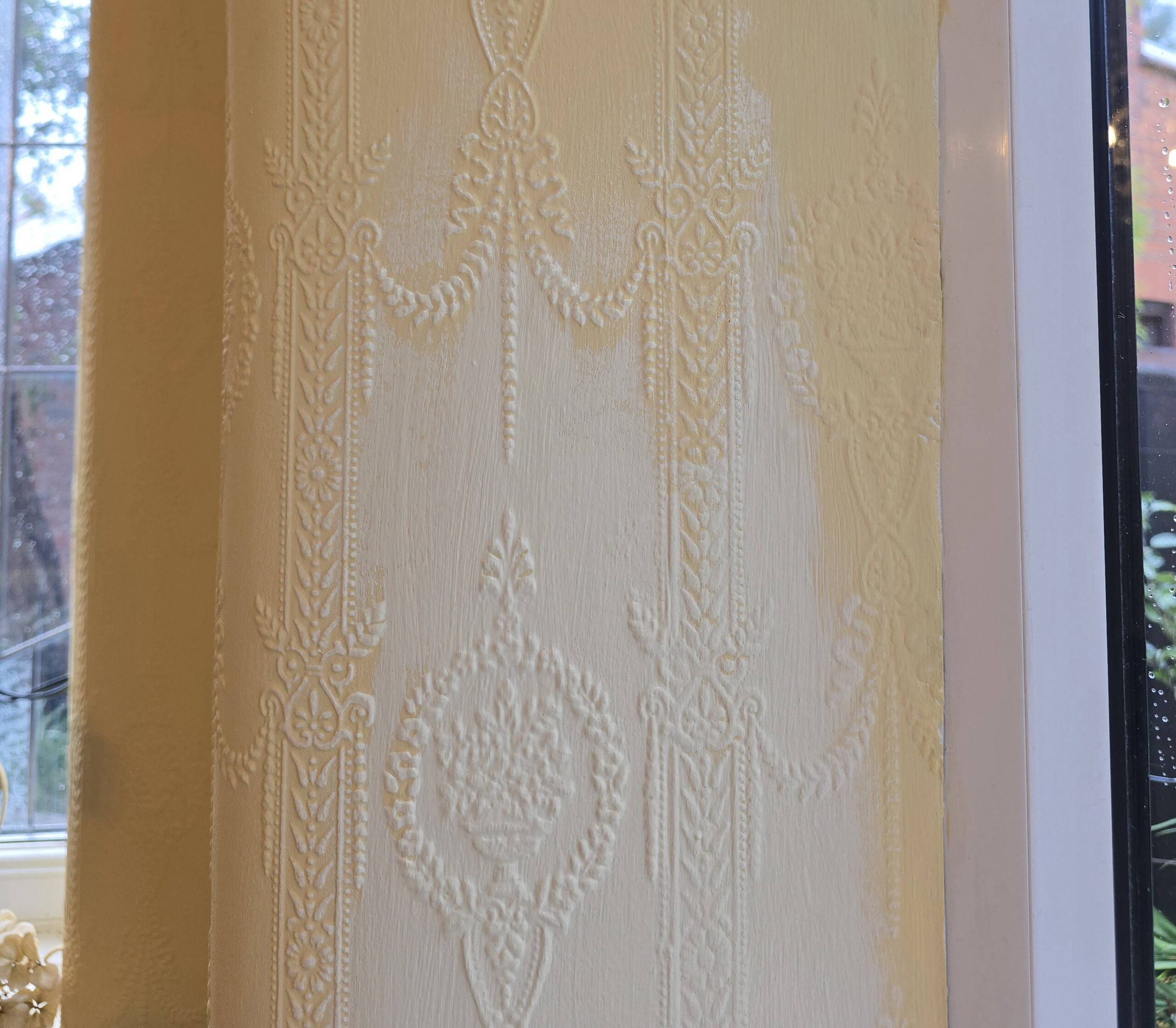 This time I chose Farrow & Ball’s Farrows Cream. I’d been put off “cream” colours previously because they sound a bit safe and dull, don’t they? A bit magnolia by another name. But this one is absolutely beautiful – warm, timeless, and cheerful without being overwhelming. It’s the perfect creamy yellow, and, look. it’s almost exactly the same shade as the buildings in France, that inspired me in the first place.
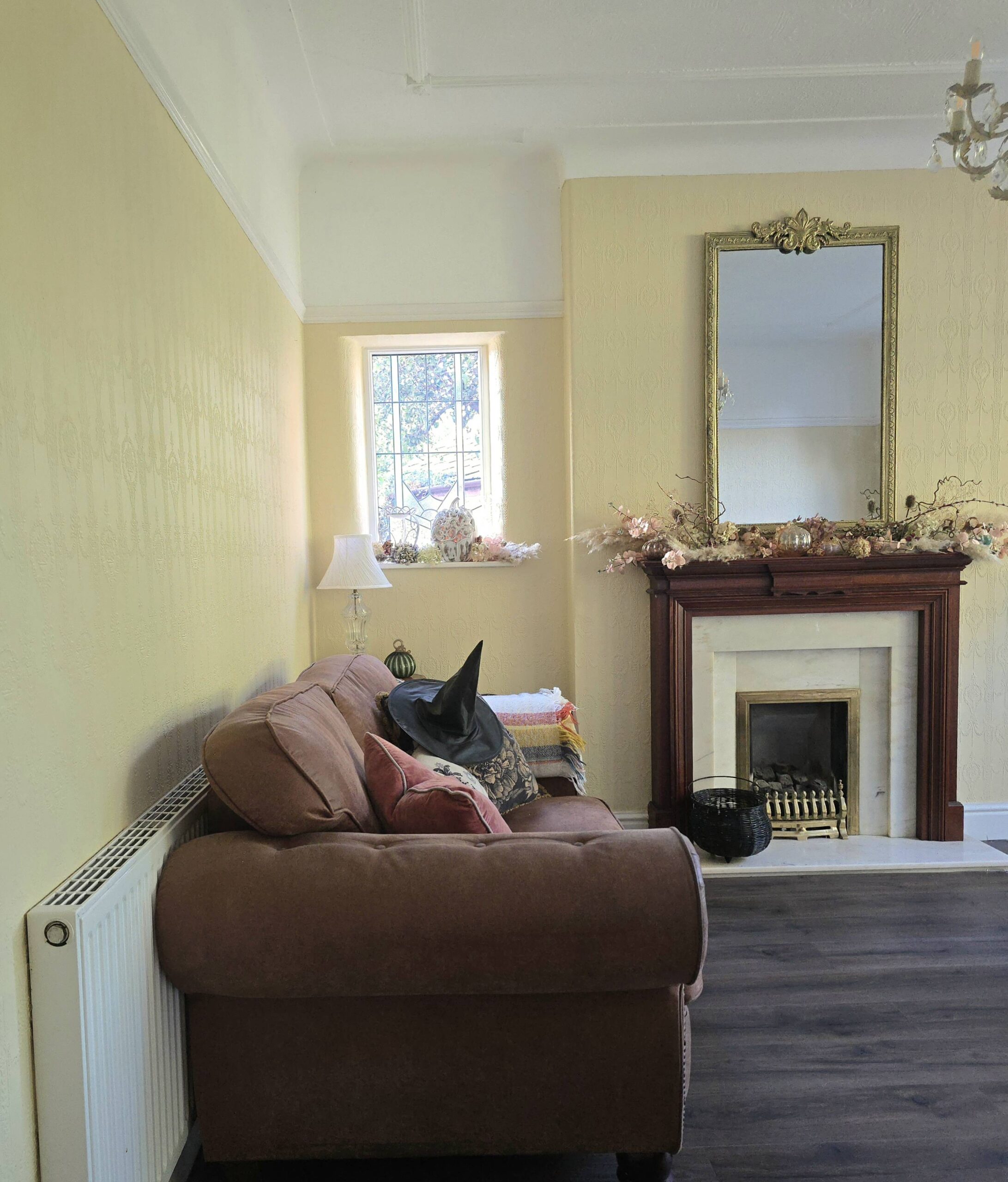 As soon as the walls were dry, Phill laid a new wooden floor. I think it was his way of ensuring I couldn’t reach for a fourth tin of paint and risk a spillage – but he needn’t have worried. I’ve finally found the one. Our living room feels like golden hour.
Love Rachel 💛